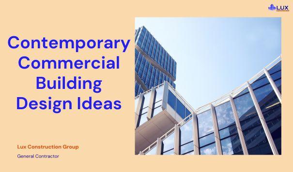
Nowadays, it’s crucial that your company and brand stand apart from rivals. But very often, your commercial exterior building itself also needs to make a strong visual impression.
With so many contemporary, cutting-edge companies making their mark these days, you’ll likely want a modern, innovative building design that matches the forward-thinking ideas driving your business.
Your commercial building’s exterior is a chance to make a bold statement about your brand’s identity and values.
An eye-catching, unique architectural design can help your company’s physical presence grab attention and create a memorable impression on customers, clients, and partners visiting the site. The building becomes part of communicating your brand image and positioning.
Are you looking for fresh and innovative ideas for commercial exterior design that can spark creativity and inspire?
Take a look at the following write-up. We are going to present some innovative commercial building design ideas.
Contents
Modern Commercial Building Design Ideas
These ten commercial buildings feature stylish, cutting-edge designs that are guaranteed to catch everyone’s eye.
Use them as inspiration to create your own modern commercial building masterpiece.
-
Transitional Design
Modern building design can blend classic and contemporary elements. In this case, architects combined sleek panels with shiplap wood-look siding. Traditionally, shiplap consists of horizontal wooden planks, but here it’s updated with an industrial finish and exposed rivets for a rugged vibe.
Pairing these wood-look sections with smooth panels creates a transitional style, merging rustic and modern aesthetics.
This blend gives the building an updated yet familiar feel, nodding to older industrial structures while maintaining a streamlined, fresh look. The result is a unique, distinctive design.
-
Attention to Detail
You don’t have to use textured siding that looks like wood to achieve a natural look. This building combines smooth, flat panels with ones that have a wood grain texture, all framed with contemporary trim pieces.
The result is a warm, natural aesthetic reminiscent of wood siding while maintaining a sleek, modern look suitable for a contemporary commercial building.
By harmonizing smooth and wood grain paneling and tying it together with clean trim lines, the design blends natural materials with contemporary minimalism. This approach offers the organic feel of wood without looking rustic or outdated.
If you want a natural wood look but also a fresh, modern style, this mixed material approach provides the best of both worlds. The exterior stays contemporary and streamlined while offering natural warmth and detailing through woodgrain textures.
-
Repeating Lines
To prevent a contemporary building facade from looking dull, repeating clean lines across different surfaces, materials, and colors is effective. In this example, architectural panels, lap siding, windows, and iron balcony railings all feature straightforward lines, creating a cohesive visual flow.
This linear aesthetic applied to varied elements like siding, glass, and metalwork, achieves a fresh, modern feel without becoming boring. The repetition of lines ties diverse materials together harmoniously.
Instead of each component standing out separately, the consistent lines allow them to complement each other. The mix of materials adds textural variety, but the unifying line motif ensures it doesn’t look jarring.
Overall, the facade uses multiple surfaces like panels, siding, glass, and iron, with linear patterning preventing it from looking disorganized. The lines create a clean, contemporary flow that is visually engaging yet sleek and intentional, avoiding a dull appearance.
-
Fresh, Fun Colors
If your new and modern business wants to make a bold statement, consider using a vibrant color like chartreuse green for your building’s exterior.
This eye-catching hue communicates a contemporary, youthful spirit and ensures your building won’t go unnoticed. Advanced color application methods for fiber cement panels guarantee that the vivid shade won’t fade over time, maintaining its brilliance for years.
Choosing a bold, lively color allows the architecture to express your brand’s personality and make a lasting impression.
-
Shifting Perspective
Many people think a building’s exterior design is limited to just the wall siding. However, additional features like bump-outs, balconies, and eave overhangs can add visual interest. This design demonstrates how contrasting trim colors and siding styles can enhance these areas.
In this building, smooth architectural panels cover the main walls, while woodgrain lap siding in different colors accents the eaves. This contrast adds texture and color, preventing the eaves from looking plain and blending in.
By using varied trim and accents, the design creates depth and dimension, making the facade more visually appealing. Highlighting smaller architectural elements with distinct materials and colors elevates the entire exterior, showing that attention to detail can transform the overall look.
-
Pops of Color
Not all building facades need to be flat. This modern commercial building uses protruding bump-outs to add visual depth and dimension.
These bump-outs are highlighted with a contrasting color, making them stand out and preventing the facade from looking one-dimensional.
The strategic use of these elements creates a vivid and dynamic exterior, transforming it into something sculptural and eye-catching.
-
Mixed Materials
Contemporary buildings look most attractive when they incorporate visual interest, intricate details, and a sense of depth. In this example, using different materials like masonry, architectural panels, trim pieces, and a metal and wood pergola creates a dynamic, multi-layered aesthetic.
Varied textures and materials introduce dimension and complexity, enticing you to examine the design closely. Smooth panels contrast with rough masonry, and the pergola’s intersecting lines add an eye-catching feature.
Blending materials with different surfaces and finishes adds visual appeal and prevents the exterior from feeling dull. This mix of masonry, paneling, metalwork, and woodwork results in a thoughtfully layered composition full of depth and contrast. For a sophisticated yet compelling presence, a diverse material palette with ornate accents like pergolas makes a striking architectural statement.
-
Smooth, Bold Siding
Simplicity can make a powerful statement. This building uses smooth, flat panels for a minimalist exterior facade.
However, the panels are painted a bold, vibrant red. This bright color prevents the simple design from fading into the background, making the otherwise unadorned exterior really grab attention and stand out.
The minimalism combined with the eye-catching red hue creates an understated yet striking look. The simplicity puts the vivid color on center stage for maximum impact.
-
Subtle Design
Using architectural panels on a commercial building creates a sleek, modern look. For a minimalist design, matching the trim to the wood-look panels maintains a streamlined appearance.
This uniform color scheme offers a smooth, seamless exterior without distractions. The wood texture adds subtle interest while keeping the design minimal and contemporary.
For a refined, understated look, use panels and trim in one unified color.
-
Multi-faceted Appearance
For large commercial buildings, trim details are crucial for a cohesive look. In this example, wood-textured trim is used consistently, tying the exterior together.
To avoid monotony, architects mixed materials like glass, flat panels, and lap siding, adding visual interest and dimension.
This approach balances unity and variation, creating a visually engaging, modern building. The trim provides coherence, while diverse materials add depth and appeal.
-
A New Angle
You can highlight a building’s height and vertical lines with angled panels. Here, panels angled like arrowheads draw the eye upward, creating a sleek and contemporary look. These angled panels emphasize the building’s tall stature subtly but effectively.
To maintain a cohesive appearance, the same angled panels are used in different arrangements on the sides, unifying the entire exterior. This repetition prevents any single area from looking disconnected and ties the design together.
The upward-angled panels accentuate height, while similar elements across other sections create a unified design language. The angles become a signature motif, subtly enhancing the building’s vertical lines and providing a cohesive, contemporary aesthetic.
The result is a building with enhanced vertical emphasis and integrated design through strategic material selection and shaping.
Tell Us About Your Commercial Building Project!
Modern commercial building design is all about combining functionality with aesthetic appeal.
By using elements like smooth panels, bold colors, and angled details, you can create structures that are not only practical but also visually striking. We are a Los Angeles-based commercial construction company with over 35 years of experience in building contemporary commercial projects.
We specialize in bringing these innovative design ideas to life. Whether you’re looking to build from scratch or remodel an existing space, our team in Los Angeles is dedicated to delivering high-quality, modern solutions that meet your unique needs.
Let us help you make a bold statement with your next commercial project.
